Spectral analysis of irregularly sampled signal
Vibration analysis is the first indicator that something is maybe wrong with your industrial machine. You can say it is a red flag for impending problems like misalignment, unbalance, looseness, worn or broken gear, damaged bearing races and many more. For our clients in Ascalia, we use vibration analysis, condition monitoring and predictive maintenance to detect anomalies and increase the usable life of machinery. Based on that, we can detect defects long before the damage is seen by physical maintenance and long before it damages other components.
When the industrial machine such as a pump or saw is operating, it generates vibrations which then can be measured with an accelerometer. The accelerometer generates a voltage signal proportional to the amount and the frequency of vibration. If you store these time waveforms into the data-collectors and analyze them hourly, you can detect errors very fast and act accordingly. You can appoint a vibration analysis or use a set of machine learning algorithms, but both of them usually have the Fast Fourier Transform as a starting point.

The Fast Fourier Transform (FFT) is a mathematical calculation intended to decompose a signal into all its frequencies. If you know regular working frequencies, you can easily detect unusual vibrations. The FFT is based on the idea that you are sampling the signal at regular intervals - every Δt seconds. If your data violates this assumption, it produces quite unexpected, incoherent and noisy results. This doesn’t mean that your data is wrong, it is just measured at inconsistent intervals. Nonuniform sampling might be due to imperfect sensors, mismatched clocks, or event-triggered phenomena. You can resample or interpolate the signal onto a uniform sample grid, but this will add undesired artifacts to the spectrum and might lead to analysis errors. Thus, we will introduce you to a better approach and teach you how to use the Lomb-Scargle periodogram (more details below) to make a proper frequency analysis of irregularly-sampled signals.
Example of recovering signal from unevenly sampled signal
Generate uniform signal
First, we need to generate a signal. With the use of numpy, we create regular sinusoid with a period of 1 day:
import numpy as np
oneday = 60*60*24 # one day in seconds

# Signal parameters
amplitude = 5. # signal amplitude
period = 1 * oneday # period in seconds
frequency = 1.0 / period # frequency in Hertz
omega = 2. * np.pi * frequency # frequency in rad/s
phi = 0.5 * np.pi # phase offset in rad

N = 1000 # length of signal
dt = 30 * 60 / 1.0 # sampling rate = 30 minutes
timesteps = np.linspace(0.0, N*dt, N) # sampling time in seconds
signal = amplitude * np.sin(omega * timesteps + phi) # time waveform
Let’s see how our signal looks like and plot it:
import matplotlib.pyplot as plt
%matplotlib inline
# plot the signal
plt.figure(figsize=(14,4))
plt.plot(timesteps, signal)
plt.xticks(oneday * np.arange(22), [str(i) for i in np.arange(22)])
plt.xlabel('Time (days)', size=14)
plt.ylabel('Signal value', size=14)

Irregularly-sampled data
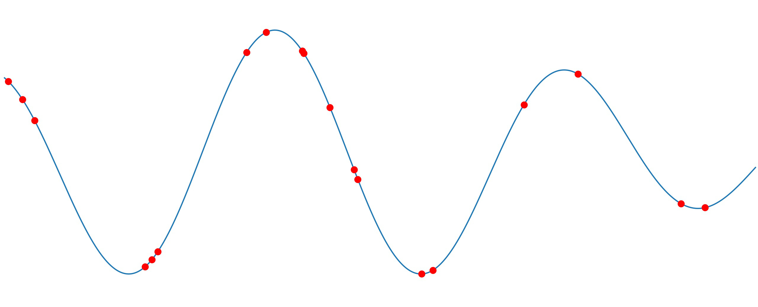
As we are investigating unevenly sampled time waveform, we are selecting just 5% of all points that define our original signal. With the use of numpy.random.rand(), we generate an array with uniform random values but with the same length as our input signal. Then, we select a fraction of signal based on the random array element and a threshold:
fraction = 0.05 # fraction of points to select
random_mix = np.random.rand(signal.shape[0])
irregular_timesteps = timesteps[random_mix >= (1.0 - fraction)]
irregular_signal = signal[random_mix >= (1.0 - fraction)]

# Plot signal + irregulary-sampled signal
plt.figure(figsize=(14,4))
plt.plot(timesteps, signal, 'k', alpha=0.3, label="Original signal")
plt.plot(irregular_timesteps, irregular_signal, '.', label="Irregulary-sampled signal",
markersize=14)
plt.xticks(oneday * np.arange(22), [str(i) for i in np.arange(22)])
plt.xlabel('Time (days)', size=14)
plt.ylabel('Signal Value', size=14)
plt.legend(loc='lower center', ncol=2, bbox_to_anchor=(0.5, -0.35))

# Plot just irregulary-sampled signal
plt.figure(figsize=(14,4))
plt.plot(irregular_timesteps, irregular_signal, '.', markersize=14)
plt.xticks(oneday * np.arange(22), [str(i) for i in np.arange(22)])
plt.xlabel('Time (days)', size=14)
plt.ylabel('Signal Value', size=14)

The Lomb-Scargle periodogram
The Lomb-Scargle periodogram is one of the methods of least-squares spectral analysis, which estimates a frequency spectrum based on the least-squares fit of sinusoids to data samples. Periodogram effectively tells you how much power in the signal exists at each frequency. We will use the optimized implementation from SciPy, function lombscargle() with a list of angular frequencies to calculate signal strength. We normalized it to have the same amplitude as the original signal (see scipy.signal.lombscargle for more info):
import scipy.signal

periods = np.linspace(0.1 * oneday, 10 * oneday, 10000) #Periods to calculate signal strength
angular_frequencies = 2 * np.pi * 1.0 / periods
periodogram = scipy.signal.lombscargle(irregular_timesteps, irregular_signal,
angular_frequencies)
normalized_periodogram = np.sqrt(4 * (periodogram / irregular_signal.shape[0]))
Now, let’s plot periodogram. We marked true value of sinusoid period as red vertical line:
plt.figure(figsize=(14,4))
plt.plot(periods, normalized_periodogram, linewidth=1.5)
plt.axvline(1 * oneday, lw=2, color='red', alpha=0.7, linewidth=2)
plt.xticks(np.arange(10) * oneday, [str(t) for t in np.arange(10)])
plt.xlabel('Period $T$ (days)', size=14)
plt.ylabel('Spectrum', size=14)

We can see that the spectral maximum is achieved for a period of 1 day, which is the true period of our signal. In practice, we had a similar problem while monitoring the vibration of a saw in one sawmill. Due to imperfect sensors and mismatched clock, data was filled with gaps. With the Lomb-Scargle periodogram, we successfully detected the working frequency of 50 Hz.
Additionally, it’s good to check phase distribution to define a signal phase shift. For period T, the phase angle is calculated as 2π*t/T:
from matplotlib import gridspec

timesteps_phased = irregular_timesteps % (1 * oneday)
phase_angles = 2 * np.pi * timesteps_phased / (1 * oneday)

fig = plt.figure(figsize=(14,4))
gs = gridspec.GridSpec(1, 2, width_ratios=[2, 1])

# Irregulary sampled data
ax1 = plt.subplot(gs[0])
ax1.scatter(irregular_timesteps, irregular_signal, c=irregular_timesteps, cmap='Set3')
ax1.set_xlabel('Time (days)', size=14)
ax1.set_ylabel('Signal Value', size=14)
ax1.set_xticks(oneday * np.arange(22))
ax1.set_xticklabels([str(i) for i in np.arange(22)])

# Phase of the data
ax2 = plt.subplot(gs[1])
ax2.scatter(phase_angles, irregular_signal, c=irregular_timesteps, cmap='Set3')
ax2.set_xticks([0, 0.5 * np.pi, np.pi, 1.5 * np.pi, 2 * np.pi])
ax2.set_xticklabels(['0', '$\pi/2$', '$\pi$', '$3\pi/2$', '$2\pi$'])
ax2.set_xlim(0, 2*np.pi)
ax2.set_ylabel('Signal Value', size=14)
ax2.set_xlabel('Phase $\phi$ (radians)', size=14)

The minimum of phase distribution is phase shift, in our case π. So, if you need to reconstruct the signal, you have all the information you need: period and phase shift. For real data, the procedure should be repeated for multiple periods and the reconstructed signal is a sum of all of them.
In conclusion, spectral analysis is a key step in every vibration analysis and condition monitoring. As seen in this article, even irregularly sampled data can give you some valuable results, so no need to discard it immediately. However, always have in mind the limits of your sampling to avoid aliasing. The highest frequency that can be successfully recovered from a sampled time waveform is Nyquist frequency (1/2*sampling frequency). Select and adjust sampling depending on the frequency you want to measure.
Read more about spectral analysis, Lomb-Scargle periodogram and Nyquist frequency:
- Vibration Analysis Explained by Jonathan Trout
- Spectrum Analysis – the key features of analyzing spectra by Jason Mais (SKF USA Inc.)
- Understanding the Lomb-Scargle Periodogram by Jacob T. VanderPlas
- Aliasing by Bruno A. Olshausen